Why The Rule of Thirds Is Rule #1 for Visual Art
The Rule of Thirds is the closest thing to a law when it comes to visual design, including photographs and illustrations. Opinions and tastes may differ, but most artists utilize the rule of thirds to make their images look appealing. If you aren’t familiar with this simple concept, it can be a great way to improve the aesthetic quality of anything you’re working on.
You’ve probably seen the rule of thirds in action when watching your favorite movie or looking at pics by professional photographers. The difference is immediately obvious when comparing these expertly framed pics with the average snapshot. The premise is very simple. It has to do with how the canvas or image is composed spatially.
You take any frame and divide it, literally, into 9 separate pieces. Or into “thirds” in each axis. Like so.
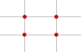
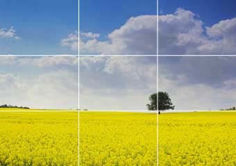
You then set up or frame your subject so that the main point of interest falls in or near intersecting points within the image.It doesn’t have to line up exactly, but it should be close. It makes an enormous difference to the aesthetic feel. This example below, from a Wikipedia article, illustrates the same landscape shot. One is framed using the rule of thirds, and one is not. What do you think of the difference?

This concept can be applied to any kind of image. You’ll see it applied when doing other landscapes…
It can also be used on photos of wildlife, like this…
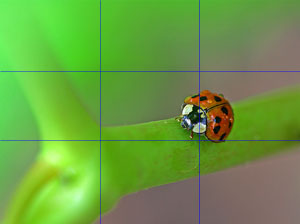
or this…
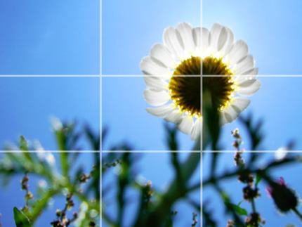
But the rule of thirds can also be used to help spice up photographs and images of people. The average snapshot taken with a handheld camera often has too much headroom at the top or is too centered. But look how much better it looks when you put the subject off center using the rule of thirds:
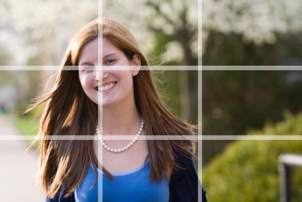
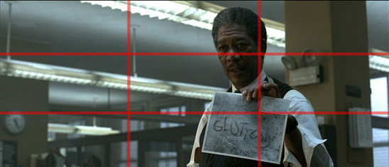
The rule of thirds is also a great way to add professionalism to movies you may be shooting. You can tell the difference between an amateur video and a professional video by the way the cinematographer frames the shot. Typically a film camera frame will be rectangular, with a 1.77:1 aspect ratio, which makes the framing more dramatic. While you probably won’t be using a film camera any time soon, a typical DSLR camera has an aspect ratio that looks like a movie.
You can also use the rule of thirds in web design. Designing an aesthetically pleasing site for your visitors not only makes them feel more welcome, but can also lead to an increase in conversions.
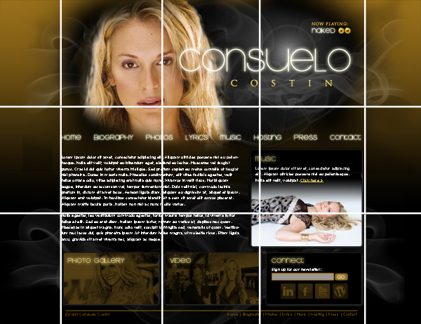
In fact, the aesthetics and rule of thirds can be more important to making your visitor feel comfortable than a fancy design or artwork.

The simple addition of the rule of thirds to your design or photos can really make a difference in the quality of your visual design!


2 Responses to Why The Rule of Thirds Is Rule #1 for Visual Art